Top 10 Color Palettes for Home Interiors in 2025
When it comes to home interiors, color is one of the most powerful elements that can define the mood, ambiance, and style of a space. As we approach 2025, the trends in color palettes for home interiors are shifting toward more versatile, calming, and sophisticated tones, reflecting the broader changes in lifestyle, technology, and our collective preferences. The right color palette can make a room feel larger, brighter, cozier, or more inviting, depending on the intention behind it.
In this article, we will explore the top 10 color palettes for home interiors in 2025, providing insights into the shades that are predicted to dominate and how they can be applied across different rooms and spaces.
Table of Contents
1. Earthy Neutrals: Grounded and Calming
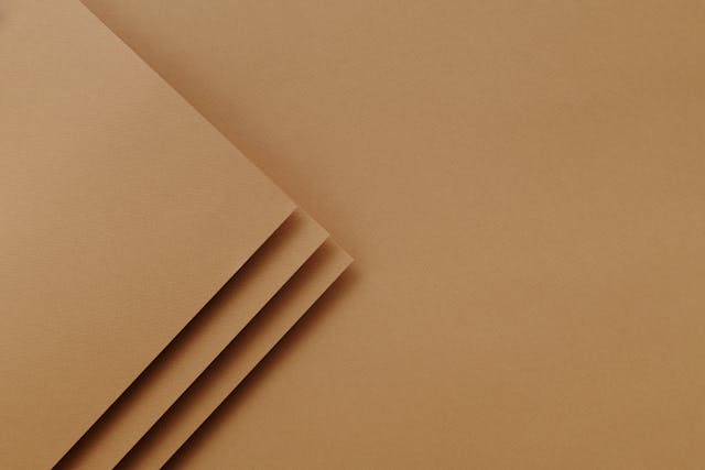
The Rise of Earthy Tones
As we continue to seek comfort and tranquility in our home environments, earthy neutrals are making a significant comeback in 2025. These shades are inspired by natural materials like stone, sand, wood, and clay. Earthy neutrals such as taupe, warm greys, soft browns, and sandy beiges are incredibly versatile and work well in a variety of settings, from modern apartments to rustic cottages.
Popular Earthy Shades
Some of the key colors within this earthy palette include:
- Warm Taupe: A soft, understated brown with hints of grey, perfect for creating a serene atmosphere.
- Stone Grey: A neutral with cool undertones, ideal for living rooms and kitchens where you want a calm, sophisticated space.
- Clay Red: A muted terracotta shade that adds depth and warmth to walls or furniture.
How to Use Earthy Neutrals
- Living Rooms: Combine warm taupe walls with light wood furniture and soft textiles like linen or cotton. A few house plants can add a pop of greenery.
- Bedrooms: Soft beige walls paired with warm wood furniture will create a peaceful sanctuary. Layer with comfortable, earthy-toned bedding and rugs for added coziness.
2. Soft Pastels: Subtle and Dreamy
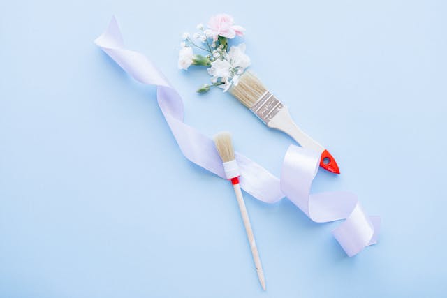
A Softer Approach to Color
Soft pastels have always been a favorite for those seeking a light, airy vibe, and in 2025, they’re expected to be more refined and sophisticated. Think delicate shades like pale lavender, dusty rose, soft mint, and baby blue. These shades are perfect for creating spaces that feel light, fresh, and rejuvenating.
Popular Pastel Shades
- Pale Lavender: A calming, almost greyish purple that works well in bedrooms and bathrooms.
- Dusty Rose: A muted, pinkish hue that can create an inviting, romantic feel.
- Soft Mint: A subtle green that adds a refreshing, clean touch to living areas or kitchens.
How to Use Soft Pastels
- Living Areas: Light pastel shades for walls or accent decor items like throw pillows, vases, and curtains will infuse a space with charm and serenity.
- Bedrooms: Soft lavender walls with muted pink or mint accents create a soothing, dreamy atmosphere. Use soft fabrics like velvet or linen for a tactile experience.
3. Bold and Vibrant Jewel Tones

A Return to Rich and Regal Shades
In contrast to the soft pastels, jewel tones are making a powerful comeback in 2025. These rich, saturated colors—emerald green, sapphire blue, ruby red, and amethyst purple—are perfect for those looking to make a bold statement in their home decor. Jewel tones can be used to evoke a sense of luxury, sophistication, and drama.
Popular Jewel Tones
- Emerald Green: A deep, luxurious green that brings a sense of nature and opulence to any room.
- Sapphire Blue: A bold, rich blue that feels calming and regal, perfect for living rooms or home offices.
- Amethyst Purple: A vibrant purple that adds a creative and artistic touch to bedrooms or entertainment spaces.
How to Use Jewel Tones
- Living Rooms: Consider deep emerald green or sapphire blue accent walls, paired with neutral furniture for balance. Throw in some metallic gold or silver accents for an added luxurious feel.
- Dining Rooms: Amethyst purple can work beautifully on statement furniture pieces, such as dining chairs or an upholstered bench.
4. Moody Blues and Greens: Inviting and Peaceful
Serene Yet Mysterious
Moody blues and greens are perfect for creating deep, rich environments that feel cozy and intimate. These tones, which include shades like navy, forest green, and teal, work well in spaces meant for relaxation and unwinding.
Popular Moody Shades
- Navy Blue: A classic shade that feels timeless and elegant, ideal for bedrooms, living rooms, or study spaces.
- Teal: A greenish-blue that evokes the ocean, perfect for bathrooms and coastal-inspired interiors.
- Forest Green: A deep, earthy green that brings the outdoors inside, great for spaces like living rooms or home offices.
How to Use Moody Blues and Greens
- Bedrooms: Moody blues like navy on walls paired with lighter furniture and bedding can create a restful, sophisticated environment.
- Bathrooms: Forest green tiles or teal-painted cabinets can create a serene and refreshing retreat.
5. Warm and Inviting Oranges and Reds
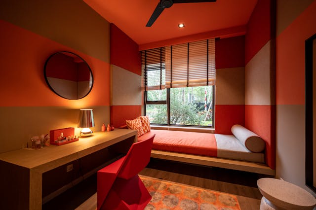
Energizing and Bold Choices
While neutral tones and pastels are great for creating calm, the inclusion of warmer colors like oranges, corals, and reds in the home is gaining popularity for 2025. These colors are energizing, passionate, and create a welcoming atmosphere.
Popular Warm Shades
- Burnt Orange: A deeper, subdued orange that adds warmth without overwhelming a space.
- Coral: A vibrant pinkish-orange that brings a playful and dynamic vibe.
- Cherry Red: A bright, bold red that injects energy into any room.
How to Use Warm and Inviting Oranges and Reds
- Living Rooms: Use burnt orange on feature walls or accent pieces like pillows or throws to create an inviting, cozy atmosphere.
- Kitchens: Coral can be a fun choice for backsplashes, bar stools, or even kitchenware, adding a burst of personality to the space.
6. Monochromatic Grays: Timeless and Modern
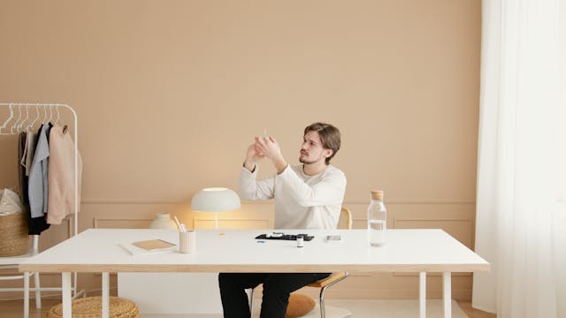
Sleek and Sophisticated
Monochromatic gray schemes have long been associated with sleek, modern design, and in 2025, this trend is continuing to evolve. Rather than just using flat grays, designers are exploring different shades and textures of gray to create a more nuanced, sophisticated look.
Popular Gray Shades
- Charcoal: A deep, dark gray that can create a moody, contemporary feel.
- Silver Gray: A metallic-tinged gray that adds an element of glamour and elegance.
- Cloud Gray: A soft, pale gray that evokes a sense of calm and openness.
How to Use Monochromatic Grays
- Living Rooms: Layer different shades of gray from light to dark across walls, furniture, and textiles to create depth and dimension.
- Home Offices: A combination of charcoal and silver-gray tones can create a focused, productive environment without feeling too harsh.
7. Nature-Inspired Greens and Browns

Bringing the Outdoors In
As sustainability and nature-inspired design continue to be popular, greens and browns will dominate home interiors in 2025. These shades evoke a sense of calm, freshness, and a connection to the earth, which is more important than ever as we seek to make our living spaces more mindful and restorative.
Popular Nature-Inspired Shades
- Olive Green: A muted, earthy green that works well in any room.
- Moss Green: A rich, textured green perfect for adding depth to living rooms or bedrooms.
- Cinnamon Brown: A warm, spicy brown that brings a cozy, grounded feeling to any space.
How to Use Nature-Inspired Greens and Browns
- Living Rooms: Pair moss green accent walls with cinnamon brown furniture and decor for an inviting, nature-filled space.
- Bedrooms: Olive green walls paired with wooden furniture bring the natural world inside, creating a calm and serene atmosphere.
8. Soft Metallics: Luxe and Elegant

Metallics with a Subtle Twist
While bold metallics like gold and silver have been popular for years, the trend is shifting toward softer, more subtle metallics for 2025. These include shades like rose gold, champagne, and brushed brass, which add a touch of elegance and sophistication without overwhelming a space.
Popular Soft Metallic Shades
- Rose Gold: A delicate metallic hue with a warm, pinkish tint that adds a luxurious feel.
- Champagne: A pale gold that evokes a sense of understated glamour.
- Brushed Brass: A soft, matte gold tone that adds warmth and sophistication.
How to Use Soft Metallics
- Living Rooms: Consider soft metallic accents in furniture legs, light fixtures, or decorative accessories for a refined look.
- Bathrooms: Rose gold or champagne accents in mirrors, faucets, or sconces can add a touch of elegance without feeling too over the top.
9. Bright Whites and Off-Whites: Clean and Classic
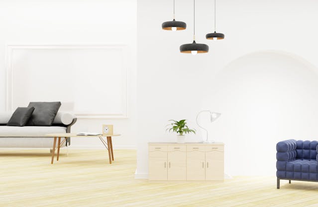
The Enduring Appeal of White
White remains a timeless choice for interior spaces, and in 2025, we are seeing a shift towards warmer whites and off-whites that are less stark and more inviting. These shades can create a clean, airy space that acts as a perfect backdrop for other colors and textures.
Popular White Shades
- Warm White: A creamy white that feels cozy and inviting while still providing a fresh look.
- Ivory: A soft, off-white with a hint of yellow that adds warmth to any space.
- Soft Cream: A pale, yellowish white perfect for creating a welcoming, cozy ambiance.
How to Use Bright Whites and Off-Whites
- Living Rooms: Warm white walls create an inviting canvas for colorful furniture or artwork. Use soft cream textiles like rugs and pillows to maintain a comfortable, relaxed atmosphere.
- Kitchens: Ivory cabinetry with brushed brass handles creates a sophisticated and timeless look.
10. Muted Metallics: Subtle and Refined
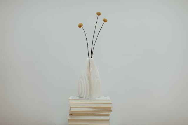
The Return of Subtle Shine
In contrast to the bold metallics of past years, muted metallics are making their mark in 2025 home interiors. These include brass, aged gold, and burnished copper—shades that provide a refined shine without overpowering a space.
Popular Muted Metallic Shades
- Aged Gold: A soft, vintage gold that adds warmth and sophistication without being too flashy.
- Burnished Copper: A reddish-brown metallic that provides depth and richness.
- Brushed Silver: A subtle metallic finish that can add a modern touch without too much shine.
How to Use Muted Metallics
- Living Rooms: Integrate muted metallic accents through light fixtures, side tables, or framed artwork to create a refined atmosphere.
- Bedrooms: Soft gold or copper accents in furniture pieces like headboards or lamps add warmth and style without feeling too bold.
FAQs about Color Palettes for Home Interiors in 2025
What are the most popular color palettes for home interiors in 2025?
In 2025, the most popular color palettes for home interiors include earthy neutrals, soft pastels, bold jewel tones, moody blues and greens, warm oranges and reds, monochromatic grays, nature-inspired greens and browns, soft metallics, bright whites and off-whites, and muted metallics. These colors reflect a mix of comfort, sophistication, and luxury, with a strong focus on nature and sustainability.
How can I incorporate bold colors like jewel tones into my home?
Jewel tones like emerald green, sapphire blue, and amethyst purple can be incorporated into your home through accent walls, statement furniture, or decorative accessories such as throw pillows, rugs, or artwork. For example, a rich sapphire blue accent wall can make a living room feel luxurious, while a velvet emerald green sofa can add elegance without overwhelming the space.
Are earthy neutral tones suitable for small spaces?
Yes, earthy neutrals are ideal for small spaces because they tend to create a sense of calm and openness. Soft shades like warm taupe, stone grey, and sandy beige can make a room feel larger and more inviting. These tones can also act as a neutral backdrop for bolder accent colors or textures, ensuring the space doesn’t feel too flat or dull.
What are some tips for using pastels in modern home interiors?
To effectively use pastels in modern home interiors, it’s important to balance them with neutral or darker tones to prevent the space from feeling too soft or one-dimensional. For example, combine a pastel lavender wall with a deep charcoal or navy sofa, or add pastel-colored throw pillows to a neutral-colored couch for a playful yet refined look.
How can I mix metallics with other color palettes in my home?
Muted metallics like rose gold, brushed brass, and aged copper can be combined with a variety of color palettes. For example, warm metallics pair well with earthy neutrals or moody blues and greens to add sophistication and elegance. You can use metallic accents in furniture legs, light fixtures, or decorative accessories such as picture frames, mirrors, or lamps.
What color palette is best for creating a relaxing bedroom environment?
For a relaxing bedroom environment, consider using soft pastel shades like pale lavender or dusty rose, or earthy neutrals such as warm taupe and soft beige. These colors create a calm, peaceful atmosphere, which is essential for rest and relaxation. To further enhance the calming effect, use soft, natural fabrics like linen or cotton for bedding and curtains.
Can I combine multiple color palettes in a single room?
Yes, you can combine multiple color palettes in a single room as long as you maintain a cohesive design. For instance, you can pair soft pastels with earthy neutrals, or mix moody blues with soft metallic accents for a modern and sophisticated look. The key is to use color in a balanced way, ensuring that one palette serves as the dominant theme and others function as accents or complementary tones.
Conclusion
As we look ahead to 2025, the top color palettes for home interiors are a beautiful mix of soothing neutrals, bold jewel tones, and nature-inspired shades. Whether you’re redesigning a living room, bedroom, or kitchen, there’s a color palette to suit every mood and aesthetic. From grounding earthy neutrals to vibrant jewel tones and soft metallics, these colors offer endless possibilities for creating spaces that reflect your personal style while providing comfort and tranquility. By combining these shades thoughtfully, you can transform any room into a haven that is both stylish and inviting.

