Top 10 Ways to Use Color Psychology in Your Home Design
Color plays a powerful role in how we experience and interact with spaces. Whether it’s in the walls, furniture, or decorative elements, the colors around us can influence our mood, behavior, and overall sense of well-being. This is the essence of color psychology—understanding how different colors evoke specific emotional responses. When it comes to home design, color psychology can be a key factor in creating spaces that feel right, serve their purpose, and enhance your daily life.
This post delves into the top 10 ways to incorporate color psychology in your home design, using the right colors in the right places to evoke desired moods and improve your home environment.
Table of Contents
1. Use Soothing Colors in Bedrooms for Better Sleep
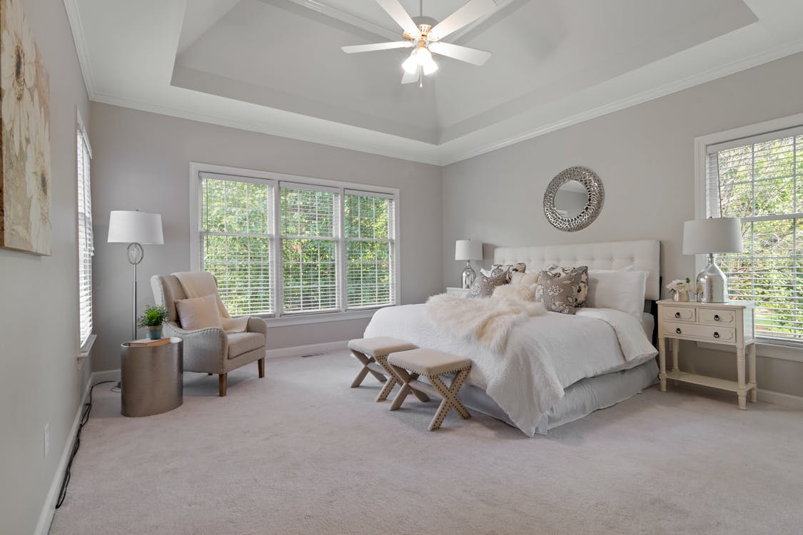
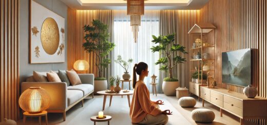
When designing your bedroom, consider incorporating soothing colors that promote relaxation and restfulness. Light blues, soft greens, and muted purples are all great choices. These colors are known to reduce stress and anxiety, helping you to wind down at the end of the day.
- Blue: Often associated with calmness and tranquility, blue helps lower heart rate and blood pressure, making it ideal for a bedroom. Light blue, in particular, promotes a serene atmosphere conducive to sleep.
- Green: Green, linked with nature, has a calming effect on the mind. It also symbolizes balance, making it a great choice for spaces where you want to feel refreshed and restored.
- Lavender: A soft lavender or light purple creates a peaceful, spa-like vibe, ideal for promoting relaxation and a sense of calm.
To balance these colors, consider using neutral tones like light beige or soft whites to avoid overwhelming the space. Textured fabrics in these calming shades can enhance the peaceful atmosphere in the bedroom.
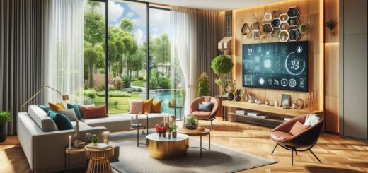
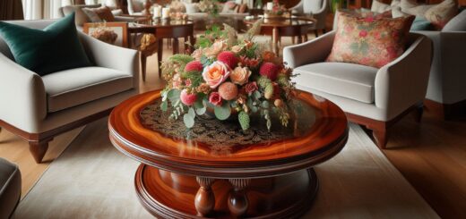
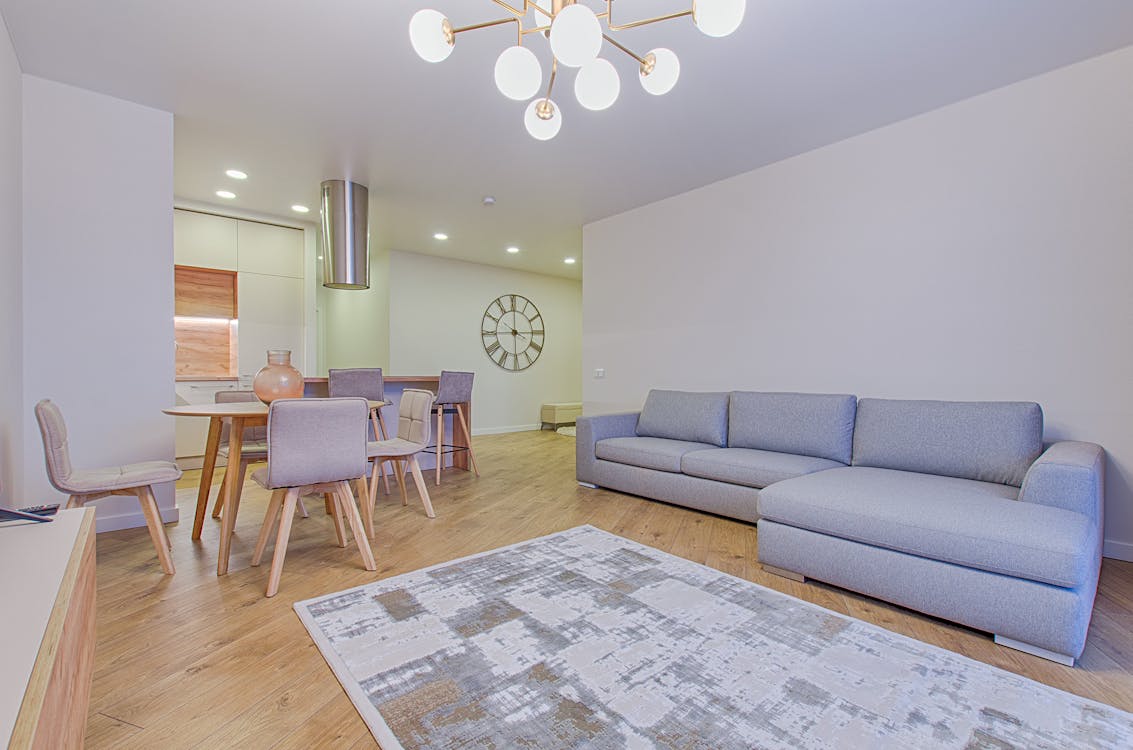
2. Energize Your Living Room with Bold Colors
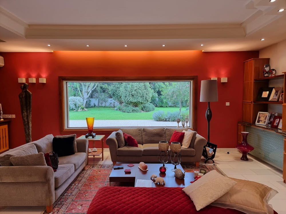
The living room is where family gatherings and entertaining take place, so you want it to feel both lively and inviting. For this, you can use bold and vibrant colors that inspire energy and conversation.
- Red: Known for its stimulating and energizing qualities, red can bring warmth and passion to a living room. However, be cautious with its use—too much red can feel overwhelming, so balance it with neutral tones or softer accents.
- Yellow: A cheerful and uplifting color, yellow evokes feelings of happiness and positivity. It can make a space feel sunny and welcoming, perfect for social interactions.
- Orange: Orange is another color that promotes energy and enthusiasm. It’s perfect for a living room that serves as a gathering space, encouraging communication and creativity.
To avoid overstimulation, you can incorporate these bold colors in accent pieces like throw pillows, rugs, or artwork, while keeping the walls in softer, neutral tones.
3. Create a Productive Home Office with Focused Colors
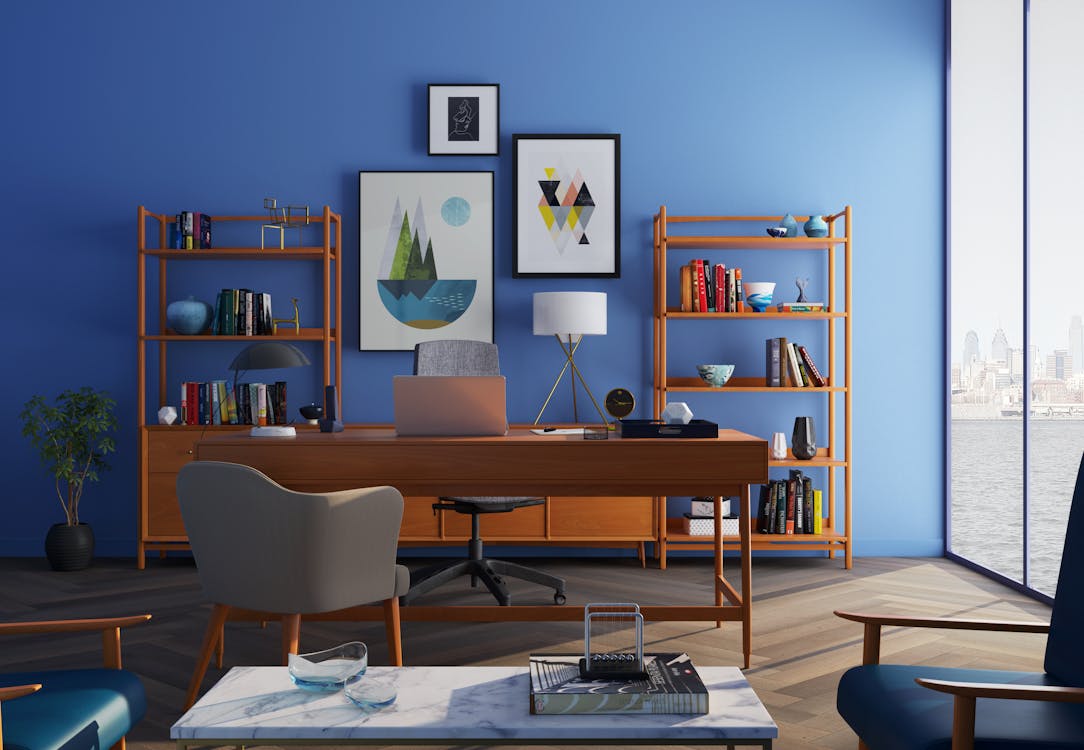
In today’s world, home offices have become an essential part of many homes. To design a workspace that boosts productivity and concentration, color psychology can help.
- Blue: Blue is a popular color for workspaces due to its association with focus and clarity. It helps increase concentration while promoting calmness.
- Green: As a color that represents balance, green encourages productivity by reducing eye strain and improving concentration. It’s especially effective in spaces where you spend long hours working.
- Gray: A neutral gray can create a balanced and professional environment without being distracting. It can also be paired with more vibrant colors to add interest and energy.
To enhance the productivity of your home office, pair these colors with functional furniture and good lighting to make the space feel both inviting and efficient.
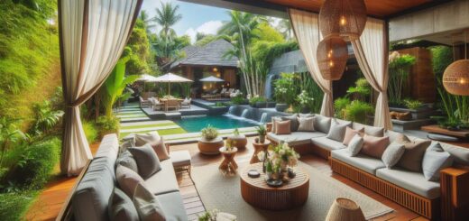
4. Incorporate Earthy Tones for Grounding and Stability
Earth tones like brown, taupe, and terracotta are ideal for creating a grounded, stable environment in your home. These colors are calming and provide a sense of security, which is perfect for high-traffic areas like the kitchen and entryway.
- Brown: Brown symbolizes reliability and stability. It’s an ideal color for spaces where you want to feel grounded and at ease.
- Terracotta: This warm, earthy shade can evoke a sense of comfort and coziness. It works well in living rooms and dining areas.
- Beige and Taupe: Neutral and versatile, beige and taupe can be used to create a soft, sophisticated background while complementing other colors in the room.
These warm, natural shades are easy to incorporate and can help create a welcoming atmosphere in areas where you entertain or spend time with family.
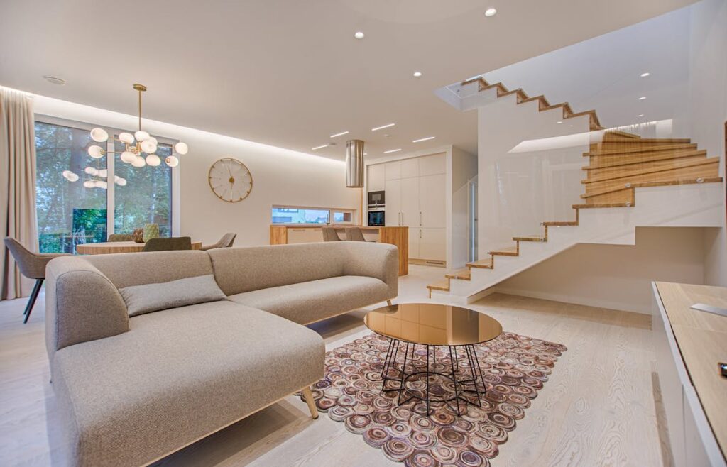
5. Use White and Light Colors for Cleanliness and Clarity
White and light colors are often associated with cleanliness, simplicity, and freshness. These colors can make a room feel open, airy, and spacious, perfect for smaller rooms or areas where you want to create a feeling of clarity.
- White: White symbolizes purity and peace. It can brighten up a room and make it feel larger. Pair white walls with minimalistic décor for a serene, clean look.
- Light Gray: Light gray can give a modern and sophisticated feel to a room without feeling too stark or sterile.
- Pastels: Soft pastel colors like pale pink, peach, or mint green can also create a fresh, clean vibe without overwhelming the senses.
In smaller spaces, such as bathrooms or entryways, light colors can create the illusion of more space while evoking a sense of calm.
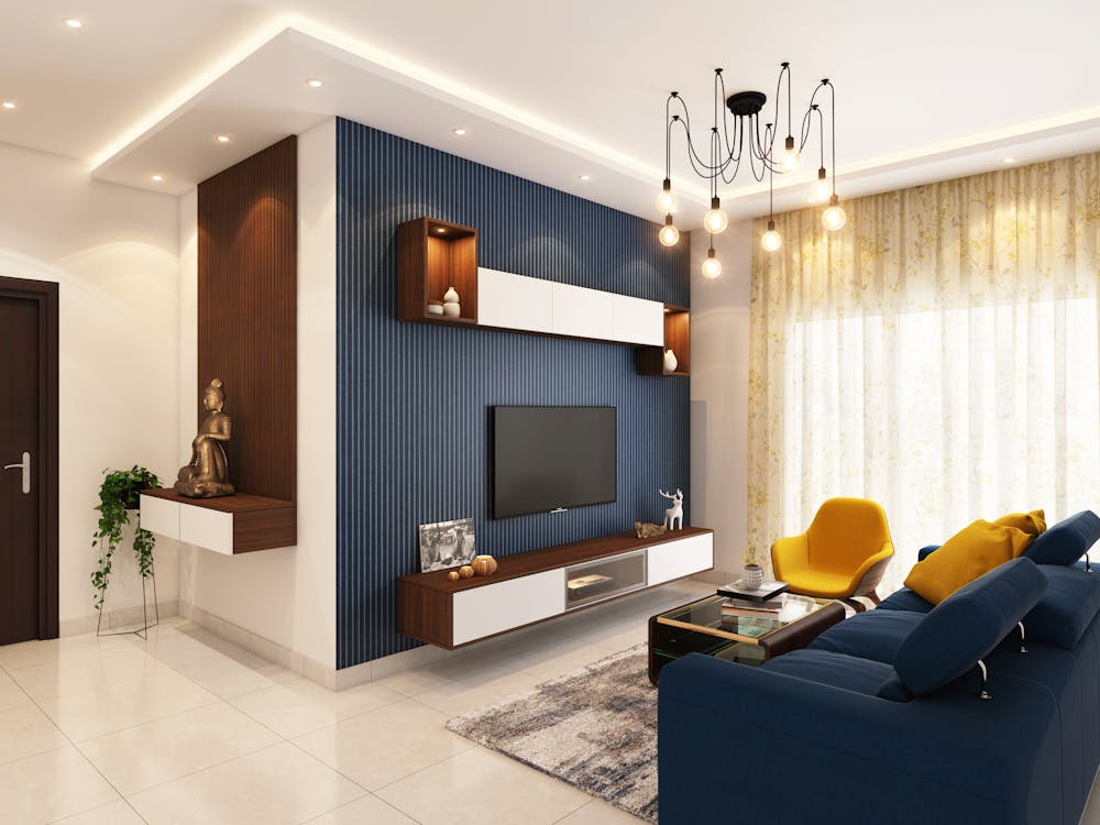
6. Incorporate Accent Walls for Dramatic Impact
If you’re looking to add drama or create a focal point in a room, accent walls are a great way to use color psychology to your advantage. Choose a color that speaks to the mood or function you want to create in that space.
- Deep Blue or Navy: Ideal for creating a sophisticated and calming environment, deep blue works well for accent walls in bedrooms or living rooms.
- Rich Green: A deep green can bring a touch of nature indoors, creating a peaceful and rejuvenating space.
- Bold Red or Burgundy: For a room that needs a touch of drama and elegance, red or burgundy can make a striking statement, perfect for dining rooms or living areas.
Accent walls are an excellent way to experiment with bold colors without overwhelming the entire room, and they can add a sense of depth and interest to the space.
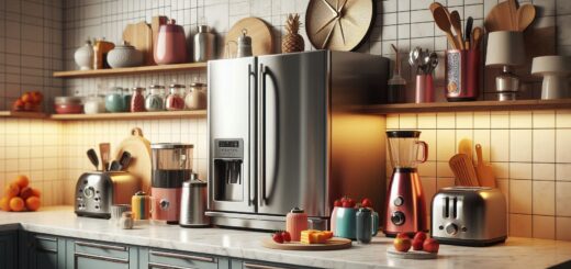
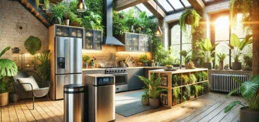
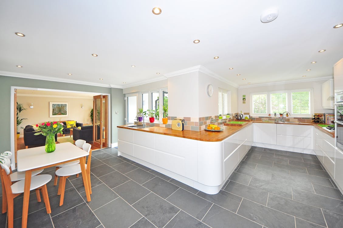
7. Utilize Yellow for a Bright and Cheerful Kitchen
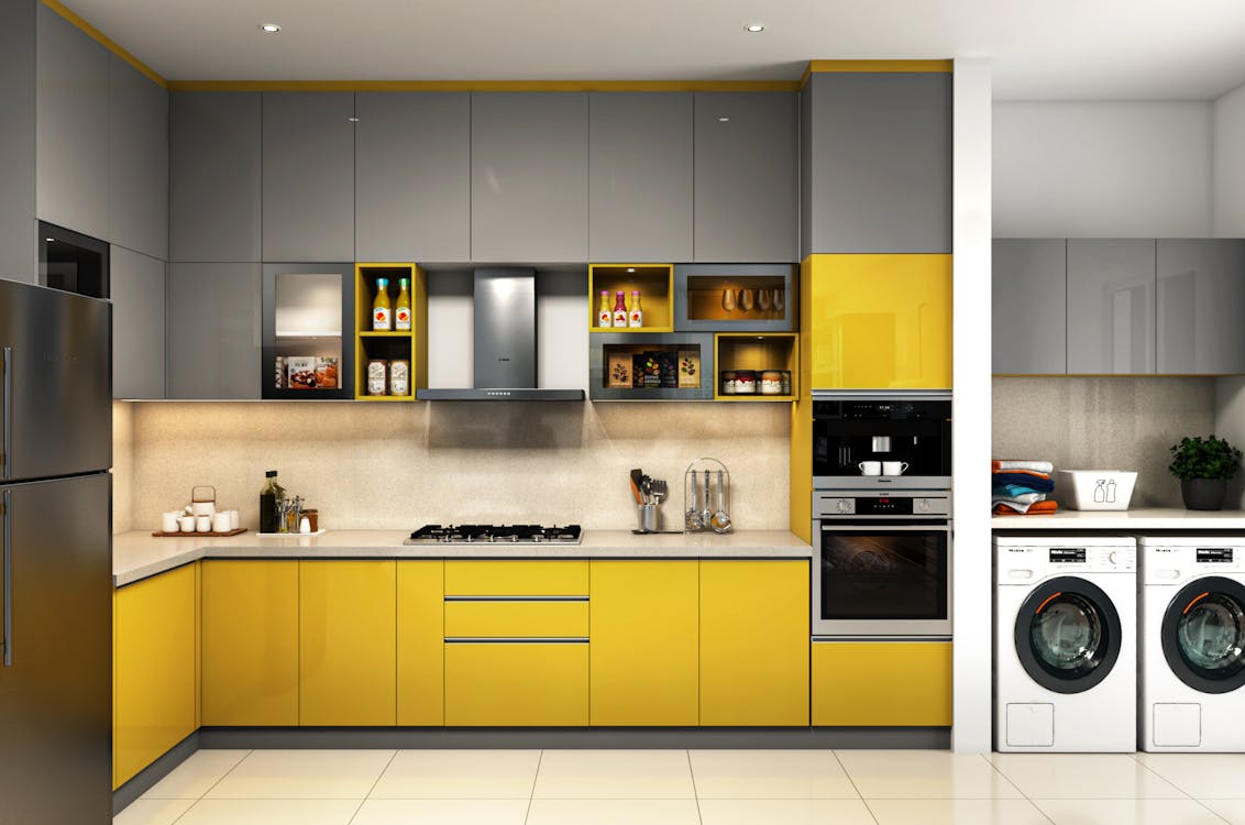
The kitchen is often the heart of the home, where family and friends gather to cook, eat, and share memories. Color psychology in this space is crucial for creating an inviting, energetic environment.
- Yellow: A warm and welcoming color, yellow encourages communication and fosters a cheerful atmosphere in the kitchen. It’s also linked to stimulating appetite and improving digestion, making it a great choice for food-related spaces.
- White: White can create a bright and clean atmosphere in the kitchen, helping to reflect light and making the space feel larger and more open.
- Soft Green: Green brings balance and a connection to nature, making it a great accent color in the kitchen. It can evoke feelings of freshness and vitality.
Incorporate yellow through cabinetry, backsplashes, or accessories like dish towels and bowls for an energizing touch in your kitchen.
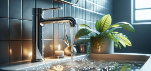
8. Create a Relaxing Bathroom with Calm Colors
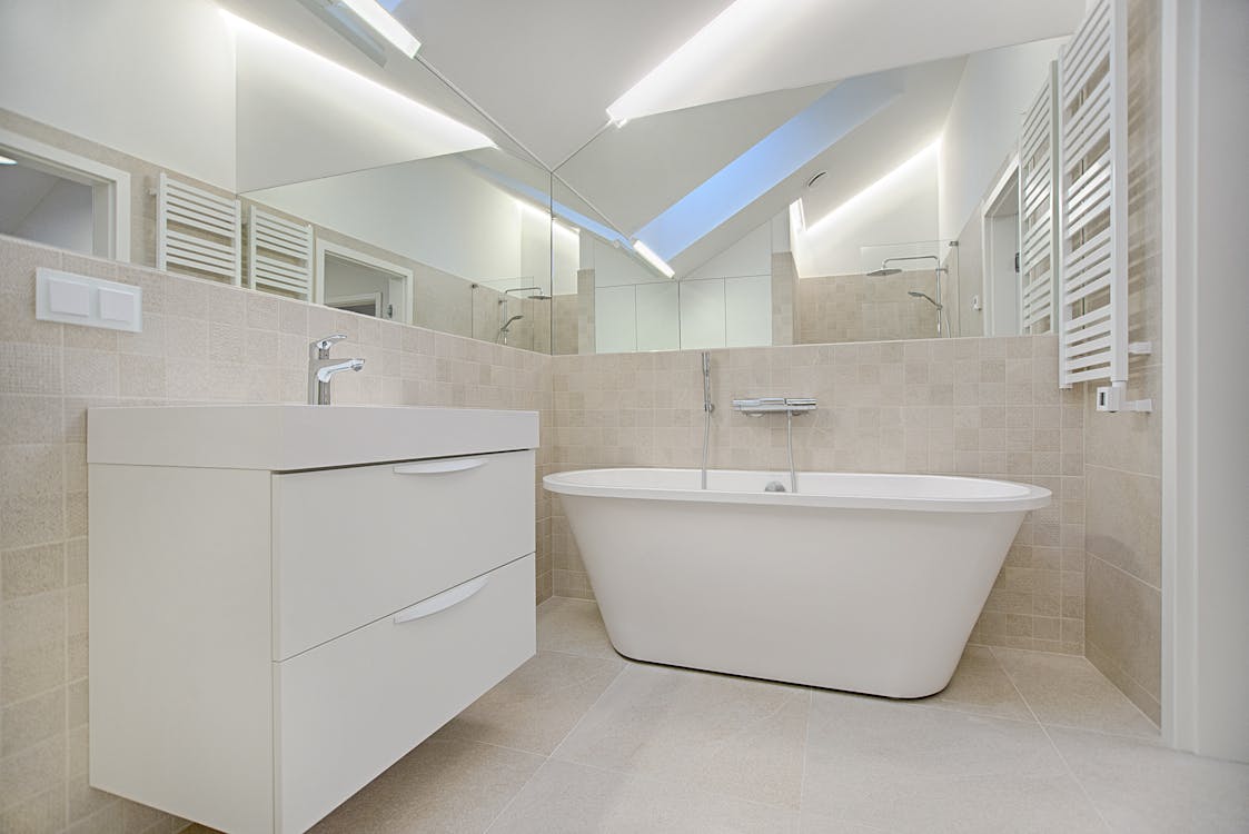
Your bathroom is a place of relaxation and personal care, and choosing the right colors can enhance that atmosphere. For this space, opt for cool and soft colors that promote tranquility.
- Soft Blue: A soft, muted blue can evoke a sense of calm and relaxation, ideal for unwinding after a long day.
- White: White is timeless and associated with cleanliness, making it an excellent choice for creating a serene, spa-like bathroom.
- Light Green: Green promotes relaxation and healing, which can make your bathroom feel like a restorative retreat.
To complement these calming tones, consider adding natural textures like wood or stone to create a more peaceful, organic feel.
9. Balance High-Energy Colors with Neutrals in Playrooms
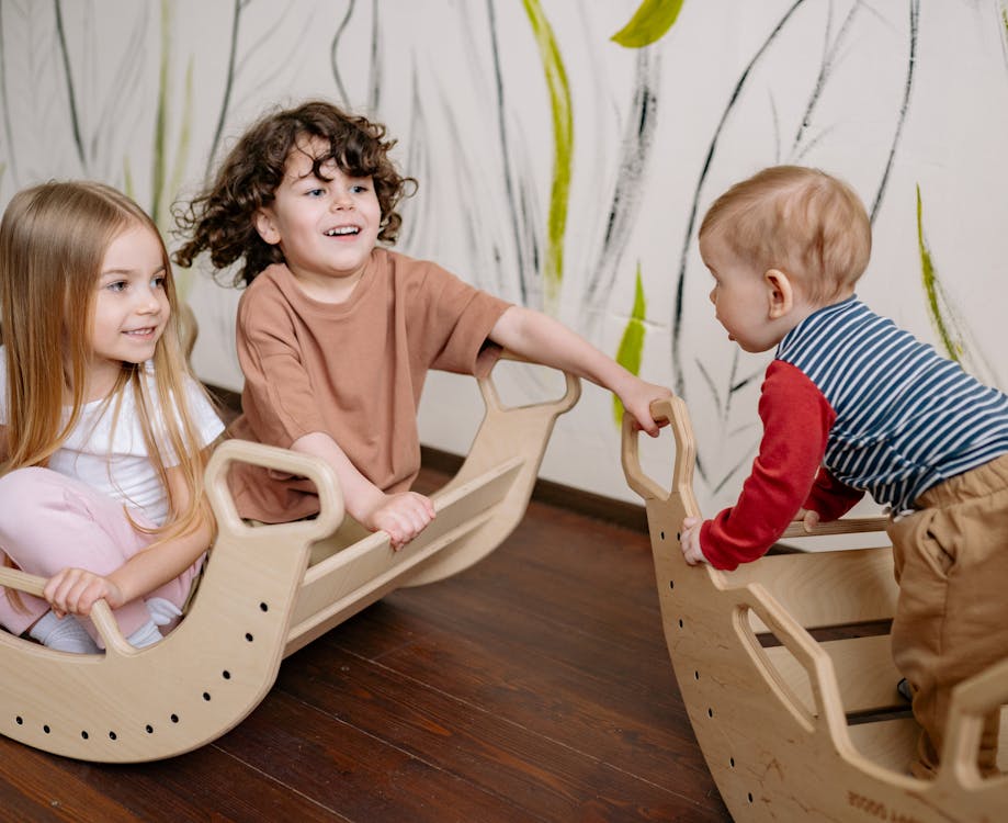
If you have a playroom in your home, the right colors can help foster creativity, joy, and focus in children. Bright, playful colors encourage active engagement, while neutral colors help balance the room.
- Bright Red, Yellow, or Orange: These colors are stimulating and can inspire energetic play. They’re great for creating a fun, lively atmosphere in playrooms.
- Soft Blue or Green: To avoid overstimulation, pair bright colors with softer tones like light blue or green. These colors balance the space and help prevent chaos.
- White or Gray: Neutral tones like white or light gray can help ground the room and allow the more vibrant colors to shine without overwhelming the space.
A good balance of bold and neutral tones can ensure that the playroom feels both energizing and comfortable for children.
10. Use Color to Reflect Your Personality and Style
Your home design should reflect your unique style and personality. By understanding the emotional impact of colors, you can create a space that feels personal and authentic.
- Warm Tones (Red, Yellow, Orange): If you want to create a cozy, inviting space that feels energetic and vibrant, opt for warm tones that make you feel comfortable and joyful.
- Cool Tones (Blue, Green, Purple): If you prefer calm, peaceful, and relaxing spaces, cool tones like blue and green are great choices.
- Neutral Tones (Gray, Beige, White): For a minimalist or modern aesthetic, neutral tones create a sleek and clean backdrop, allowing other elements of your design to shine.
By thoughtfully choosing colors based on their psychological effects, you can ensure your home is a reflection of your personal tastes and the moods you want to evoke.
The Benefits of Using Color Psychology in Home Design
Incorporating color psychology into your home design can offer numerous benefits that go beyond aesthetics. Understanding how colors affect mood, behavior, and even productivity can lead to a more harmonious and functional living space.
- Improved Mood and Well-Being: The right color can promote a positive environment, reducing stress and anxiety. For example, soft blues and greens can calm nerves, while yellow can uplift spirits.
- Enhanced Productivity: Colors like blue, green, and even gray can create environments that enhance focus, making them ideal for workspaces and home offices.
- Aesthetic Harmony: When colors are thoughtfully selected to complement one another, they create a visually appealing and balanced space, which is more pleasing to the eye.
- Increased Functionality: Colors can make spaces feel more spacious, bright, or cozy, depending on your needs. Light tones can open up smaller rooms, while darker shades can make larger spaces feel more intimate.
Current Color Trends in Home Design
The world of interior design is constantly evolving, and color trends shift each year. Understanding these trends can help you stay on top of the latest styles while still leveraging the psychological benefits of color.
- Earthy Tones: Rich browns, terracotta, and muted greens are experiencing a resurgence as people look for a deeper connection to nature. These colors offer comfort and stability.
- Sage Green: This soft, muted green has become popular for its calming effect and versatility. It’s great for living rooms, bedrooms, and kitchens.
- Neutrals with Bold Accents: Pairing neutral tones like beige, gray, or white with bold, vibrant accent colors such as navy, teal, or mustard is a trend that allows for personality and style without overwhelming the space.
- Soft Pastels: Light pastels, including soft pink, lavender, and mint, are making their mark, bringing subtle pops of color that can still maintain a calm, serene atmosphere.
Staying aware of trends can help you keep your home design fresh while still considering the psychological impact of the colors you choose.
How to Choose the Right Color for Each Room
Choosing the right color for each room involves balancing both practical and emotional needs. Here’s a step-by-step guide on how to select colors that work for you:
- Consider the Room’s Purpose: Think about the function of the room. A home office might benefit from focus-enhancing colors like blue or green, while a living room might need energizing shades like yellow or red.
- Assess the Room’s Lighting: Natural light affects how colors appear. Bright rooms can handle darker colors, while dimly lit rooms may benefit from lighter, warmer tones to make them feel more spacious.
- Identify Your Desired Mood: Reflect on the mood you want to evoke. If you’re after calmness and relaxation, lean towards cool colors. For energy and creativity, opt for vibrant shades.
- Test Colors Before Committing: Use paint samples or fabric swatches to test how a color looks in the actual space. Colors can appear differently in different lighting conditions, so it’s important to see them firsthand.
- Pair Colors with Furniture and Decor: Choose colors that complement existing furniture and décor. If you have neutral-colored furniture, adding a bold accent color can bring the space to life.
Taking time to thoughtfully select colors for each room ensures that your home reflects both your personal taste and the psychological effects you want to experience.
Common Color Psychology Misconceptions
While color psychology is a powerful tool, there are also several misconceptions that can lead to misguided design choices. Understanding these myths can help you make more informed decisions about your home’s color scheme.
- Myth 1: Blue is Always Calm: While blue can promote calmness, bright or bold blues can be invigorating, so it’s important to select the right shade for the atmosphere you want to create.
- Myth 2: Red is Always Intense: Red is stimulating, but not always overwhelming. In small doses, red can add energy and excitement without feeling chaotic. It’s all about balance and placement.
- Myth 3: Neutrals Are Boring: Neutral colors can be extremely versatile and sophisticated, adding warmth and balance to a space. They serve as an excellent base for incorporating more vibrant accent colors.
By dispelling these myths, you can make more nuanced choices when incorporating color into your home design.
How Color Psychology Enhances Your Home’s Value
Using color psychology can not only enhance your experience in your home, but it can also increase its appeal and value to potential buyers if you’re looking to sell.
- Neutral and Timeless Colors: Neutral tones like grays, whites, and beige tend to appeal to a broader range of buyers, creating a blank canvas that they can easily personalize.
- Warm and Inviting Spaces: Colors like warm tans, soft yellows, or subtle reds can make spaces feel welcoming, which is especially important in key areas like the living room and kitchen.
- Adding Bold Accent Colors: In small doses, bold accent colors (such as navy or emerald green) can create an impression of modernity and sophistication, making your home stand out without feeling overpowering.
By selecting the right color palette, you can create spaces that resonate with buyers while also maximizing the functional benefits for yourself.
FAQs About Color Psychology in Home Design
Here are answers to some of the most frequently asked questions about using color psychology in your home design:
Can the wrong color make me feel worse?
Yes, colors can influence our mood, and using the wrong color in certain spaces can have a negative impact. For example, too much red in a bedroom may lead to restlessness, while dark colors in a small room can make the space feel cramped.
How can I use color psychology if I have a small space?
Lighter colors like whites, light grays, and pastels can make a small room feel larger and more open. You can add bold accents through furniture or accessories to bring personality without overwhelming the space.
Should I stick to just one color in a room?
Not necessarily. While monochromatic color schemes can work well, layering different shades of a color or using complementary colors can create depth and interest without being overwhelming. The key is finding balance.
Are there any colors I should avoid?
While no color is inherently “bad,” some colors may not work well in certain spaces. For example, bright yellow in a bedroom may feel too stimulating, while dark brown in a kitchen might make it feel too closed in. It’s about context and balance.
How can I incorporate color psychology without painting walls?
You can use color psychology through accessories like rugs, throw pillows, curtains, and artwork. Upholstered furniture, lighting fixtures, and even the types of materials you choose (like wood or metal) can also contribute to the overall color scheme of the room.
Conclusion
As you can see, color psychology is a powerful and essential tool in home design. The thoughtful use of color can transform your living spaces by creating the right mood, improving functionality, and reflecting your personality and lifestyle. Whether you’re enhancing productivity in a home office or creating a relaxing retreat in your bedroom, color can play a significant role in shaping your home environment. By understanding how different colors affect emotions and behaviors, you can design a space that not only looks beautiful but also promotes well-being and harmony.